
Retro: not that blurry, but the cheatlines are jaggy.
B772: looks ok for me.
Moderators: richierich, ua900, PanAm_DC10, hOMSaR

Re: Post Screening: Questionable Rejections
airkas1 wrote:Retro: not that blurry, but the cheatlines are jaggy.
B772: looks ok for me.
So what can I do with that CO retro? No sharpening was used on the cheat lines. I work with masking and only sharpened on the windows without touching those cheat lines. I'll put the UA 772 in appeals if you feel it is okay. Really appreciate your input Kas.

Re: Post Screening: Questionable Rejections
Wow beautful Retro Livery ! I don't see blurry in that one and maybe just with slight OS otherwise should be ok.
The United looks ok for me. It doesn't look like Overexposed.
Best wishes,
Harry
The United looks ok for me. It doesn't look like Overexposed.
Best wishes,
Harry
Re: Post Screening: Questionable Rejections
Len, I screened the CO B737. The area of the cockpit windows as well as the main titles look blurry which is why I rejected it. Sometimes us screeners miss things. However, I looked at this one again and I'd stay with my call. You could try sharpening those areas and uploading at a smaller size (1024 pix, for e.g.). I also screened the United T7. Tone down the brightness and it should be fine (easy fix).
Jehan
Jehan
Re: Post Screening: Questionable Rejections
jelpee wrote:Len, I screened the CO B737. The area of the cockpit windows as well as the main titles look blurry which is why I rejected it. Sometimes us screeners miss things. However, I looked at this one again and I'd stay with my call. You could try sharpening those areas and uploading at a smaller size (1024 pix, for e.g.). I also screened the United T7. Tone down the brightness and it should be fine (easy fix).
Jehan
Too bad you didn't leave a personal comment letting me know what you thought and why. That definitely helps a lot! I'll add another pass of sharpening to the CO retro on those areas. The T7 definitely is an easy fix.
Re: Post Screening: Questionable Rejections
Both hit for blurry: Maybe cockpit windows on the AA 738 are soft, but didn't look blurry on my display.
https://imgproc.airliners.net/photos/air ... 498a1b8729
https://imgproc.airliners.net/photos/air ... a747d2ca33
https://imgproc.airliners.net/photos/air ... 498a1b8729
https://imgproc.airliners.net/photos/air ... a747d2ca33
Re: Post Screening: Questionable Rejections
The 757 does seem a little blurry. The AA may just need a bit more sharpening to fix it.
Re: Post Screening: Questionable Rejections
Hi Len,
Both of them seem to be soft i think ... regarding to blurry issue ,well... the 757 indeed has a little bit but the America looks better should be easy to fix.
Cheers,
Harry
Both of them seem to be soft i think ... regarding to blurry issue ,well... the 757 indeed has a little bit but the America looks better should be easy to fix.
Cheers,
Harry
Re: Post Screening: Questionable Rejections
Been a lot of rejections lately. All seem to fall blurry or soft. Probably just need to up my sharpening for the 100-400 but will drop all the links here to see if these all stand a chance for reworking:
Soft:
https://imgproc.airliners.net/photos/air ... 243aa81268
https://imgproc.airliners.net/photos/air ... 0c8b6d30a7
https://imgproc.airliners.net/photos/air ... e5539b036b
https://imgproc.airliners.net/photos/air ... 4b4373551d
Blurry/soft
https://imgproc.airliners.net/photos/air ... 0c1005ab16 (after second opinion)
https://imgproc.airliners.net/photos/air ... af76cada3e
https://imgproc.airliners.net/photos/air ... a9b4cdcba3
- The AA 738 got a boost of sharpening and didn't look soft at all on my display. Not sure where it is blurry either.
Blurry/Overexposed/Low in Frame:
https://imgproc.airliners.net/photos/air ... 1d96915a9c
- For the low in frame this was cropped based on that Delta 767 with high in frame keeping the tail in mind for when centering.
Soft/Low Contrast
https://imgproc.airliners.net/photos/air ... 264ea6ec51
- This one I really thought the sharpening is fine, especially looking at the titles. Contrast I can see a little bit by looking at the levels bars.
Soft/Underexposed
https://imgproc.airliners.net/photos/air ... f383e8c709
Blurry
https://imgproc.airliners.net/photos/air ... 4649995603
https://imgproc.airliners.net/photos/air ... bab47b0e19
- Added a bit more sharpening to this. The full size did not look blurry to me.
Re: Post Screening: Questionable Rejections
Hey Len,
First of all, congratulation to your TOP photo Retro Livery ! Very nice .
Regarding to the First group Soft pictures,
JB A320 looks ok for me.
South West B738 looks ok for me.
AA A321 looks ok for me.
United B777 looks a little bit soft toward to windows line i think.
And the second group :
JB E190, the tail looks like Blurry i guess that maybe due to Soft ?
AA B738, looks ok for me.
AA B738, not so bad but i think the Left engine has a little bit Soft.
The sharpness of the AC looks ok for me and the exposure also looks ok. But it seems indeed low in frame i think.
The sharpness of Star Alliance B738 looks not so bad. But it indeed has low contrast.
The exposure of that special livery looks o problem to me and the sharpness looks ok too.
The Delta B738's windows look a bit of blurry i think.Just part of them.
But the United B757 looks ok for me .
Best wishes,
Harry
Re: Post Screening: Questionable Rejections
Hey Len,
I just accepted this photo, but I can't for the life of me figure out what the odd blue part is that is sticking out from the tail fin. Can you please enlighten me?
I just accepted this photo, but I can't for the life of me figure out what the odd blue part is that is sticking out from the tail fin. Can you please enlighten me?
Re: Post Screening: Questionable Rejections
4x soft:
They could all use an extra kick of sharpening in my opinion
3x blurry/soft:
933NN - borderline passable, but could use some more sharpening
811NN - bit blurry/soft towards the front. May work with a bit more sharpening but no guarantees
JB - blurry tail and soft fuselage
Blurry/OE/LIF:
Blurry tail and towards the front, slightly LIF, exposure passable
Soft/flat:
Sharpening is passable for me, but it is flat. The histogram (I made a quick edit) shows that it can take some +14/15 in contrast and it should be fine
Soft/UE:
The exposure is passable, but an extra kick of sharpening would do it good I think
Blurry:
Both photos look slightly blurry
----
May I ask how you sharpening your images and with what values?
Re: Post Screening: Questionable Rejections
I am thinking that maybe is .... kind of tape from another side of tail. I guess....
Re: Post Screening: Questionable Rejections
Kas, that's the right wing's winglet that is sticking out from the other side. The rudder is turned thus exposing it. If you would like I can share some other images from the sequence with you to prove that nothing funky was done in the post processing.
Sharpening process: Image is downsized, new layer, unsharpen mask 200%, radius 0.2, threshold 0, I do it as a layer mask with the brush set at 40% opacity and brush over the windows, cockpit, nose, gear, registration. If it looks soft on my display I'll do a pass at 25% opacity on the titles. Usually don't touch the tails. I think it is trying to just relearn for my 100-400 which is known to be a softer lens than the 70-200. Lens was just recently serviced so I know it is performing to the best of its capabilities. It's a matter of honing in on the post processing now. It also doesn't help that I work on a retina display so it kind of obscures the true pixels from me.
I'm open for any suggestions on the routine.
Thanks for the input on the list.
Re: Post Screening: Questionable Rejections
Well , I have the almost same steps like u. But sometime I use " Smart Sharpen" to sharpen my pics and sometime use "Unsharpen Mask" like u. It depends on the sharpness of the original Photo. If the photo is sharpen enough and just need a little bit I will use USM 0.2 110-135 to sharpen it some time I will use less 100 if the photo is very sharp. But ... if the original one isn't sharp enough and very soft I will use Smart Sharpen with 0.3 and 23-35. It also depends on the size I use. I use 70-200 f/4 most of the pics are sharp enough for me so most of time I use USM. When I use 100-400 I or 70-200+1.4x I prefer to use Smart. Regarding to the Brush Setting ... it depends on the sharpness situation after sharpening. And I usually erase the cheat line first and then is the wings and tail. Title and REG always are the last places to erase it depends on their sharpness.
Re: Post Screening: Questionable Rejections
Few quick ones.
Tap Retro: lighting was slightly filtered but thought this was still bright enough. Dark and OS
https://imgproc.airliners.net/photos/air ... b20a508746
Blurry: maybe on the front nose gear?
https://imgproc.airliners.net/photos/air ... 0fc1b621fa
Blurry/Vignette/Underexposed: Vignette looks more along the difference in the cloud thickness than an actual vignette. Lens focal length doesn't coincide much with a vignette either. Exposure looked fine, comparable to all the accepted shots.
https://imgproc.airliners.net/photos/air ... c7f4f7ebeb
Soft/Underexposed: don't really see any of those
https://imgproc.airliners.net/photos/air ... db4be700e8
Vignette/Underexposed: Bottom corner for the vignette, but think the exposure is fine.
https://imgproc.airliners.net/photos/air ... 32dc03214b
Re: Post Screening: Questionable Rejections
The sharpnessof Tap looks ok for me but it indeed dark i think. Did u get it at the late afternoon?
United Express looks not that bad ... maybe is because of the front gear.
The exposure of the United B738 is ok for me. But the windows which under the title look bit of Blurry for me i think. Regarding to the Vignette Issue. I agree with your perspective after using Equalize to check. Because i think if it has Vignette Problem it should appear at the angle of the photo but in this case, some black area appear in
the side not only the angle and they look like some cloud i think.
United A320 looks not bad. I guess maybe the screener considered the engine ( Right ) looks blurry ... but it looks ok for me .
I agree with your point the exposure is ok for me.
Cheers,
Harry
Re: Post Screening: Questionable Rejections
TAP: Not that bad, but the lighting doesn't help
E145: Looks blurry and oversharpened to compensate
B737: The sides do look like vignetting and I agree on underexposed (see below)
A320: Sharpness is passable, but I agree on underexposed
E145: Could be brighter


E145: Looks blurry and oversharpened to compensate
B737: The sides do look like vignetting and I agree on underexposed (see below)
A320: Sharpness is passable, but I agree on underexposed
E145: Could be brighter
Re: Post Screening: Questionable Rejections
Kas,
Thanks and I was able to back in to see those images despite you being at the third party hosting max.
I'll brighten up tap a little bit and yeah the lighting killed me. 3 minutes sooner and it would have been PERFECT, but I think it stands a better chance than the Iceland. Gave it a boost in exposure by .25. Guessing sharpening was not an issue for you as well.
The others I'll make the changes as described. There was no extra sharpening on that ERJ145 for compensation of blurry. Same amount of sharpening used on that as the A320 etc.
Re: Post Screening: Questionable Rejections
Two more:
Underexposed:
https://imgproc.airliners.net/photos/air ... cf78b7d80e
Blurry (blurry tail was the comment from the screener). To me it looks more like the angle of the tail and the light reflection rather than a blurry. Original does not show anything that blurry. Might be a little soft. Lighting is absolutely horrendous. Usually this arrives before the sun comes up. On this particular day it was "late" which allowed me to shoot it with sun.
https://imgproc.airliners.net/photos/air ... b53b4651a9
Re: Post Screening: Questionable Rejections
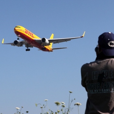
Hi , Len
The spirit could be brighter i think.
Regarding to the DHL 767 , the tail seems soft to me instead of Blurry i think and maybe just select that area and sharpen again might be better i guess. And this one seems has Vignette Issue. Especially at the left side of the picture. After using equalize it becomes more obvious.
Cheers,
Harry
Re: Post Screening: Questionable Rejections
The Spirit looks okay to me. Could of course be a tad brighter, but well...
The tail of the DHL looks indeed blurry or rather soft on your edit. Whatever causes the effect, could also be from the lense. The shot also suffers from vignetting, I would also correct that, as it might be an issue once it's screened again, and it's really easy to remove.
The tail of the DHL looks indeed blurry or rather soft on your edit. Whatever causes the effect, could also be from the lense. The shot also suffers from vignetting, I would also correct that, as it might be an issue once it's screened again, and it's really easy to remove.
Re: Post Screening: Questionable Rejections
The Spirit A321 could use a boost in brightness.
DHL: Rear section is blurry. Contrast and brightness appears low which could be contributing to the soft appearance. Looks noisy to me as well. I also see a bit of vignetting n the upper left corner.
Jehan
DHL: Rear section is blurry. Contrast and brightness appears low which could be contributing to the soft appearance. Looks noisy to me as well. I also see a bit of vignetting n the upper left corner.
Jehan
Re: Post Screening: Questionable Rejections
Spirit looks passable on my screen.
DHL does look like a blurry tail. Very soft at best.
DHL does look like a blurry tail. Very soft at best.
Re: Post Screening: Questionable Rejections
Thanks Jehan, Harry, JK, and Kas.
I brightened the spirit just a little bit and resubmitted. If that gets rejected then I'll appeal the first rejected version
As for the DHL it probably was a very soft and due to the angle and lighting that hit that section of the tail in the sequence. Went with a different angle that was not as soft with a bit more sharpening. https://imgproc.airliners.net/photos/air ... c31a7e9648
Brightness will be a small issue with this photo as the time of day. It's tough to catch DHL in good lighting at Newark unless you have ramp access to where it is parked. It is in before sunlight and out after darkness. This new one from the sequence looks like it has no vignette in it.
Some new ones:
Fedex 77F: Blurry/Personal "entire aircraft looks blurry especially around the titles"
https://imgproc.airliners.net/photos/air ... a50ebdee65
Full Size: https://www.flickr.com/photos/93082249@ ... 75/sizes/l
Alaska 738:
Original rejection was underexposed:
https://imgproc.airliners.net/photos/air ... 45963741c7
Now rejected for overexposed with personal "Whites now blown out"
https://imgproc.airliners.net/photos/air ... fd6399f686
Ethiopian 788:
Rejection for low contrast and blurry
https://imgproc.airliners.net/photos/air ... 7b4a2e94cb
full size: https://www.flickr.com/photos/93082249@ ... 40/sizes/l
airkas1 wrote:Spirit looks passable on my screen.
DHL does look like a blurry tail. Very soft at best.
I brightened the spirit just a little bit and resubmitted. If that gets rejected then I'll appeal the first rejected version
As for the DHL it probably was a very soft and due to the angle and lighting that hit that section of the tail in the sequence. Went with a different angle that was not as soft with a bit more sharpening. https://imgproc.airliners.net/photos/air ... c31a7e9648
Brightness will be a small issue with this photo as the time of day. It's tough to catch DHL in good lighting at Newark unless you have ramp access to where it is parked. It is in before sunlight and out after darkness. This new one from the sequence looks like it has no vignette in it.
Some new ones:
Fedex 77F: Blurry/Personal "entire aircraft looks blurry especially around the titles"
https://imgproc.airliners.net/photos/air ... a50ebdee65
Full Size: https://www.flickr.com/photos/93082249@ ... 75/sizes/l
Alaska 738:
Original rejection was underexposed:
https://imgproc.airliners.net/photos/air ... 45963741c7
Now rejected for overexposed with personal "Whites now blown out"
https://imgproc.airliners.net/photos/air ... fd6399f686
Ethiopian 788:
Rejection for low contrast and blurry
https://imgproc.airliners.net/photos/air ... 7b4a2e94cb
full size: https://www.flickr.com/photos/93082249@ ... 40/sizes/l
Re: Post Screening: Questionable Rejections
Hello Len,
The DHL seems a little bit low in Frame for my standard. And i think it is a bit of soft. Also it can be brighten i think.
Fedex B77F : I am not quiet sure this one but it doesn't show so blurry for me from the small size but a little bit OS i think.
Alaska : I prefer the first one ,the engine of the second one seems little bit Overexposed for me.But the first one indeed seems underexposed for me.Maybe you added too much to it ?
Here is my editing for this one : https://www.flickr.com/photos/153041003 ... ed-public/
ET B788 : I can't see obvious Blurry from the small size pic. But maybe bit of underexposed ? And the color seems strange for me ....
Cheers,
Harry
Re: Post Screening: Questionable Rejections
HI Len,
titles on the DHL are rather soft and would Need some more sharpeneing.
The Fedex is not blurry. Even on the small edited Version it doesn't look burry to me. If anything it shows some jaggies.
The Alaksa is tricky due to light being rather toplit. I agree that the first version is slightly underexposed or better said slightly too dark, but the new version Looks okay to me. But again due to the tricky light you likely have different opinions on that one.
Again the Ethiopian doesn't seem blurry to me, but that is increasingly used on sharpening issues these days is all I can say (judging from mine, yours and another friends shots).
Julien
Re: Post Screening: Questionable Rejections
So I appealed the Fedex and Ethiopian. I agree that it seems like there is a new trend of rejecting with blurry when images are actually just soft.
Fedex returned with: personal stating the sharpening is fine but high contrast now... Okay that's an easy fix
Ethiopian got hit with: Blurry, Quality, Soft, Low Contrast. Seems like the HS really liked that photo a lot.
Some more rejects:
VS A330: High Contrast and High in Frame after numerous second opinions and one HQ. How is this high in frame when I dropped the fuselage to accommodate the high wing/winglet? Contrast is going to be a bit more here as this was taken with a late afternoon sun.
https://imgproc.airliners.net/photos/air ... 80cff0bbf1
WN 738: Overexposed, High Contrast, Personal; Blown out highlights after one HQ. Comes down to the Sun reflection line and similar time period as the VS.
https://imgproc.airliners.net/photos/air ... 8138c49e5b
UA A320: Soft, Underexposed. Personally not seeing these.
https://imgproc.airliners.net/photos/air ... 67dafe8c1d
FI 753: Blurry, OS, Personal: blurry nose, tail, aft titles, bit OS. Appreciate a personal comment there. Didn't really think there was really any blur there.
https://imgproc.airliners.net/photos/air ... 8138c49e5b
Re: Post Screening: Questionable Rejections
VS A330 : HIF looks fine to me. But the contrast seems indeed a bit of high and also bit of underexposed to me i think.
WN 738 : Exposure is ok to me.Contrast looks not bad but could be reduced a little bit.
UA A320 : I can't see soft area and exposure looks ok for me although it could be brighter.
FI 753 : You provided a same link of WN 738.
Cheers,
Harry
WN 738 : Exposure is ok to me.Contrast looks not bad but could be reduced a little bit.
UA A320 : I can't see soft area and exposure looks ok for me although it could be brighter.
FI 753 : You provided a same link of WN 738.
Cheers,
Harry
Re: Post Screening: Questionable Rejections
VS A330: Centering looks fine, I do agree that the contrast is a bit high. You can solve this by making the shadow a bit lighter (I usually use +20 or so in these cases)
WN B738: Passable for me
UA A320: Sharpening passable, image could be brighter
FI B753: https://imgproc.airliners.net/photos/air ... 1197f86282 - That was my doing, so I guess stating my opinion again is a bit useless.
WN B738: Passable for me
UA A320: Sharpening passable, image could be brighter
FI B753: https://imgproc.airliners.net/photos/air ... 1197f86282 - That was my doing, so I guess stating my opinion again is a bit useless.
Re: Post Screening: Questionable Rejections
airkas1 wrote:VS A330: Centering looks fine, I do agree that the contrast is a bit high. You can solve this by making the shadow a bit lighter (I usually use +20 or so in these cases)
WN B738: Passable for me
UA A320: Sharpening passable, image could be brighter
FI B753: https://imgproc.airliners.net/photos/air ... 1197f86282 - That was my doing, so I guess stating my opinion again is a bit useless.
Whoops on the link for the FI and I ultimately figured it was you on that one. Usually a rejection from you gets me a personal message explaining it a bit more. Are you referring to the shadows in raw editor or the no-no shadow/highlight tool?
WN 738 into the appeals. Hopefully it has a better outcome than the Ethiopian... Can you offer me some insight on that one. If you want to do it in a PM or email, that would be fine.
Re: Post Screening: Questionable Rejections
len90 wrote:Are you referring to the shadows in raw editor or the no-no shadow/highlight tool?
Either will do, but I prefer to do most of my editing in the RAW converter. The shadow/highlight tool only becomes a no-no if used incorrectly.
The Ethiopian doesn't look flat at all, but I think I'm seeing some slight blur on the front half of the fuslage. Perhaps better at a smaller size.

Re: Post Screening: Questionable Rejections
VS A330 looks high in contrast to me, while the centering looks okay. WN 738 has a somewhat high contrast. The UA A320 seems neither soft nor underexposed, while the FI 753 does seem OS on the titles and somewhat blurry/soft towards the rear.
Agree with Kas on the Ethiopian.
Cheers,
Yang
airkas1 wrote:The Ethiopian doesn't look flat at all, but I think I'm seeing some slight blur on the front half of the fuslage. Perhaps better at a smaller size.
Agree with Kas on the Ethiopian.
Cheers,
Yang
Re: Post Screening: Questionable Rejections
Hello everyone. It's been a few months since I posted as rotations, studying, and everything else have cut back on my time so taking pictures and uploading were the two I chose to continue with when one thing had to be sacrificed.
I have this picture that got me a bit hung up and puzzled...
Original:
https://imgproc.airliners.net/photos/air ... a94c92cb15
Rejection for underexposed along with a few others. Upped the exposure by 1/4-1/3 and resubmitted them all.
Second Rejection:
https://imgproc.airliners.net/photos/air ... be3245e2da
Reason: Underexposed.
Appealed it with the following comment: "Can I please get a second look on this one. Original rejected for an underexposed. Readjusted exposure on this image like every other rejected image. Sky is identical in color (checking values) to all the other images that were accepted. Ultimately think it is just a darker appearing aircraft with the color scheme that led screener to say underexposed. Exposure is increased 0.3 from previous upload."
HS Response: Underexposed/Overexposed/Personal: "nose blown, with this kind of steep angle you will always have exposure issues (as can be seen in your rejection history), maybe you can find another spot with a more shallow angle?"
Now with that said: To anyone who has spotted at EWR you will know there is not much you can do about locations there. Secondly, you pull the shots of La Compagnie from EWR and almost all of them have a bright nose:
https://www.airliners.net/photo/La-Compa ... 8%2BM/o%3D
https://www.airliners.net/photo/La-Compa ... 8%2BM/o%3D
I have had a few photographer friends look at this one and they didn't see an issue with the exposure on the second one. To me this is more of an example of screening to try and reject a picture which is the complete opposite of what screening is meant. As for the HS, the level of scrutiny given to this picture is almost laughable given a string of horrendous nose lit/ back lit acceptances that have gotten through (especially an Air Astana picture)
Re: Post Screening: Questionable Rejections
Hi Len,
I would say that the nose reflection is unavoidable, but that it can be reduced by reducing the highlights. I did see the message pass by in the appeal E-mails and even though it's true, it's not always possible. In the case of EWR, it appears to be the latter (I wouldn't know, I've never been to NYC ).
).
That said, I do think the image can be salvaged. If you want, I'd be happy to try an edit for you.
I would say that the nose reflection is unavoidable, but that it can be reduced by reducing the highlights. I did see the message pass by in the appeal E-mails and even though it's true, it's not always possible. In the case of EWR, it appears to be the latter (I wouldn't know, I've never been to NYC
That said, I do think the image can be salvaged. If you want, I'd be happy to try an edit for you.
Re: Post Screening: Questionable Rejections
The combination of bright sunshine and metallic tubes (i.e. aircraft) will ALWAYS lead to blown areas - it's just a by-product of aviation photography. Neither of your edits are technically under-exposed, however this site tends to use the term 'under-exposed' to mean a little too dark for its liking. I once had a rejection for a small globule of sunflash on an aircraft's nose - common sense swiftly prevailed and it was accepted on appeal.
Re: Post Screening: Questionable Rejections
JakTrax wrote:The combination of bright sunshine and metallic tubes (i.e. aircraft) will ALWAYS lead to blown areas - it's just a by-product of aviation photography. Neither of your edits are technically under-exposed, however this site tends to use the term 'under-exposed' to mean a little too dark for its liking. I once had a rejection for a small globule of sunflash on an aircraft's nose - common sense swiftly prevailed and it was accepted on appeal.
Hence why I brought this up and basically the point I tried to make in my appeal. Sadly common sense that prevailed in your example did not and led to a both overexposed and underexposed rejection on appeal.
Kas, I'll look through the series, but don't think there will be much else. As for the spot, there really isn't anything. Spotting around EWR is tough in terms of locations and even worse with the law enforcement. Police around the airport have been pretty aggressive around spotters leading to most people not even bothering to spot there much anymore unless something rare/special is coming. If you notice, there aren't really many photographs showing up from EWR in the past few years from other photographers. It's basically just me and Cary Liao.
Re: Post Screening: Questionable Rejections
airkas1 wrote:I would say that the nose reflection is unavoidable, but that it can be reduced by reducing the highlights.
That area is quite likely blown in the original photo, in which case reducing the highlights will simply make the area a darker white.
To actually get a non-blown nose in that photo, I'd wager you'd have to underexpose the whole photo by two stops.
All that said, while I don't particularly like that blown area, if this were a white airplane, it would likely be accepted with no one the wiser. The rest of the exposure in the 2nd edit looks just fine.
Re: Post Screening: Questionable Rejections
The blown nose is actually passable for me, but a bit brighter for the rest wouldn't hurt. In Photoshop, I tried to tweak the levels a bit to +10/1.20/250. So in my opinion, there is room for improvement.
Re: Post Screening: Questionable Rejections
airkas1 wrote:The blown nose is actually passable for me, but a bit brighter for the rest wouldn't hurt. In Photoshop, I tried to tweak the levels a bit to +10/1.20/250. So in my opinion, there is room for improvement.
I'll upload again with those exact settings, but I highly doubt it will get through. Ultimately you look at the metallic blue paint, it's bound to have some hot area.
And trust me on EWR. It is a tough airport to spot around due to lack of spotting locations and law enforcement.
Re: Post Screening: Questionable Rejections
So it looks like Kas was right on the La Compagnie.
Submitted 19 pictures from that same location in perfect sunlight only 6 accepted
9 rejections for Oversharpened and High Contrast: The contrast on all of these is nearly identical to what has been accepted time and time again from this location. Also given the sun angle this is the contrast. The sharpening, I don't have a good monitor to look at right now. On my school laptop and the hospital computers these don't look like they are suffering from any jagged areas. All had the same sharpening routine: windows, cockpit, gear, nose, registration, engines (if necessary)
N421UA: https://imgproc.airliners.net/photos/airliners/1/4/2/4711241.jpg?v=v4ce79acd717
N178DZ: https://imgproc.airliners.net/photos/airliners/3/3/2/4711233.jpg?v=v4cb819f05a2
N806SK: https://imgproc.airliners.net/photos/airliners/1/3/2/4711231.jpg?v=v41cba381f8c
N77019: https://imgproc.airliners.net/photos/airliners/7/2/2/4711227.jpg?v=v45b68f13f9e
N58101: https://imgproc.airliners.net/photos/airliners/3/2/2/4711223.jpg?v=v43c8198c991
N933NN: https://imgproc.airliners.net/photos/airliners/9/1/2/4711219.jpg?v=v4c1ab110fb7
N772UA: https://imgproc.airliners.net/photos/airliners/7/1/2/4711217.jpg?v=v45fb2f6218b
N26232: https://imgproc.airliners.net/photos/airliners/1/1/2/4711211.jpg?v=v44ce7172015
N838VA: https://imgproc.airliners.net/photos/airliners/7/0/2/4711207.jpg?v=v40a2c6c3442
High Contrast: I actually have already appealed this one with this image as my reference point:
https://imgproc.airliners.net/photos/airliners/5/0/2/4711205.jpg?v=v4cbcaa55f05
2 for High Contrast and Underexposed: To me the exposure on these two look identical to all the other images that were submitted.
https://imgproc.airliners.net/photos/airliners/9/9/1/4711199.jpg?v=v4edc03d7fa8
https://imgproc.airliners.net/photos/airliners/5/9/1/4711195.jpg?v=v4231e85222a
And of course I need to end with the other La Compagnie registration on an underexposed rejection
https://imgproc.airliners.net/photos/airliners/3/9/1/4711193.jpg?v=v41c664cef28
Thanks in advance!
Re: Post Screening: Questionable Rejections
Some are a bit contrasty, but nothing too major in my opinion. None of them strike me as oversharpened or underexposed outside tolerable levels.
Re: Post Screening: Questionable Rejections
I would say that most of them are ok to me although some of those Sharpness look bit of OS to me, It still looks nice.
Re: Post Screening: Questionable Rejections
Thanks... Another large batch of rejections: Mostly for soft.
Soft:
Delta CRJL: https://imgproc.airliners.net/photos/air ... 0539c29593
UA N36272: https://imgproc.airliners.net/photos/air ... 893b77f5b2
UA March of Dimes: https://imgproc.airliners.net/photos/air ... e5e22fff9d
UAX N752YX (also has an info/builder rejection): https://imgproc.airliners.net/photos/air ... 254b13a120
UA N27239: https://imgproc.airliners.net/photos/air ... 1095550c61
UA N61881: https://imgproc.airliners.net/photos/air ... c6dbb74793
Blurry/Soft:
AA 738: https://imgproc.airliners.net/photos/air ... 260e434dd8
Soft/Underexposed:
FX MD11: https://imgproc.airliners.net/photos/air ... e9d9c46c78
AC Express: https://imgproc.airliners.net/photos/air ... f24477b857 (This one also has a compression rejection as well which I can't figure out. Saved and worked through exactly like every picture)
Blurry: think
UA -700 SA (think this is more sun glare related): https://imgproc.airliners.net/photos/air ... 7fa93cb7c0
UA N37413: https://imgproc.airliners.net/photos/air ... 548fd1bb8b
UA N17753: https://imgproc.airliners.net/photos/air ... 8047a1f4cb
Blurry/Underexposed:
UA N12216: https://imgproc.airliners.net/photos/air ... d58b909ff8
Oversharpened: https://imgproc.airliners.net/photos/air ... f1adbad46f
Re: Post Screening: Questionable Rejections
Hi Len,
My take:
Delta CRJ: Blurry (all over) more than soft.
UA N36272: Soft. Marginally passable.
UA March of Dimes: Passable for me
UA N752YX: Nose area is blurry. We should not be rejecting solely for incorrect "Builder", but might be mentioned if there are other reasons for rejection
UA N27239: Could use more contrast and sharpening (too soft for my liking).
UA N61881: Looks OK for me.
AA 738: Agree with blurry and soft
FX MD11: Blurry: Yes; Under exposed: Not for me.
AC Express: Agree with soft and under exposed.
UA -700 SA: Quite blurry in the front section of the aircraft.
UA N37413: Blurry nose
UA N17753: Front hald is Blurry (titles, nose)
UA N12216: I see blur in nose, engine and tail
Gulfstream: I see jaggies in the cheat lines towards the nose. These are nearly impossible to avoid on thin lines. Therefore passable for me.
Hope this helps.
Jehan
Who is online
Users browsing this forum: No registered users and 17 guests