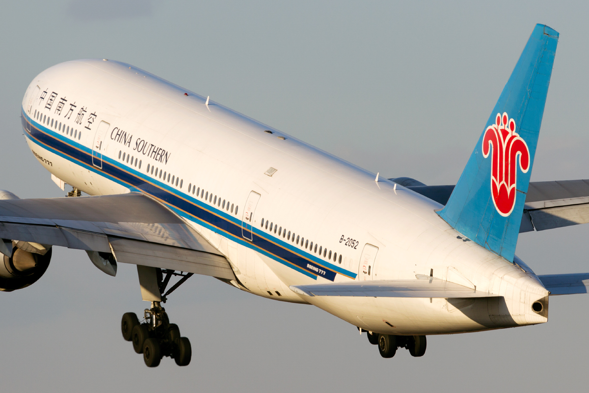
airkas1 wrote:CZ: quite yellow, otherwise passable
QF: better
Yes i can tell from the picture but ,,,if i low down the K ...i think the color will be strange so i didn't and i choose Dawn ,,,Will it be rejected ?
Moderators: richierich, ua900, PanAm_DC10, hOMSaR
airkas1 wrote:CZ: quite yellow, otherwise passable
QF: better
airkas1 wrote:You could try to selectively remove some of the saturation of the yellow color. You can find that option in the 3rd or 4th tab of the raw converter. 'Dawn' should not be applicable, it's too light for that. I would reject the image for yellow cast to be honest.
airkas1 wrote:You could try to selectively remove some of the saturation of the yellow color. You can find that option in the 3rd or 4th tab of the raw converter. 'Dawn' should not be applicable, it's too light for that. I would reject the image for yellow cast to be honest.

HarryLi wrote:airkas1 wrote:You could try to selectively remove some of the saturation of the yellow color. You can find that option in the 3rd or 4th tab of the raw converter. 'Dawn' should not be applicable, it's too light for that. I would reject the image for yellow cast to be honest.
Uh...i removed 50% yellow color and here is the photo is it acceptable ?


airkas1 wrote:You could try to selectively remove some of the saturation of the yellow color. You can find that option in the 3rd or 4th tab of the raw converter. 'Dawn' should not be applicable, it's too light for that. I would reject the image for yellow cast to be honest.


airkas1 wrote:Reply #37, first photo is better.
The second one looks more yellow and I prefer the color to be cooler. So I pick #2. But both should be passable. So up to your preference really.
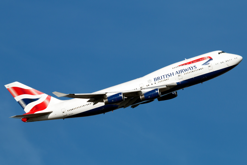
spompert wrote:Isn't that a motive rejection for cutting the engine on the left hand side?
airkas1 wrote:spompert wrote:Isn't that a motive rejection for cutting the engine on the left hand side?
A very obvious one.
airkas1 wrote:spompert wrote:Isn't that a motive rejection for cutting the engine on the left hand side?
A very obvious one.

airkas1 wrote:spompert wrote:Isn't that a motive rejection for cutting the engine on the left hand side?
A very obvious one.


jelpee wrote:Junjie,
Flypigs B737: Quite soft. Nose is a little blurry
AB B737: Blurry (titles)
RJ: A319: Soft.
KLM B737: Soft. Lighting is quite harsh as well and looks like heat hazed to me as well.
Jehan


airkas1 wrote:LH: seems passable.
LH: seems passable.
LH: soft windowline & Star Alliance titles.
AA: seems passable (although titles look very slightly OS).
AA: seems passable (although titles look very slightly OS).
LG: seems passable.
LH: seems passable.
KL: fuselage looks a bit soft.
EY: seems a bit hazed, 50/50.
GF: fuselage and tail quite soft.
FX: a bit soft, especially the titles. The rest will develop jaggies when sharpening them more. So you can use the eraser on those to get rid of any jaggies.


HarryLi wrote:This time i wonder that is it possible apper Blurry after using Eraser to clean Jaggy? Because i uploaded photos recently most of them were rejected with Blurry i am very curious about it
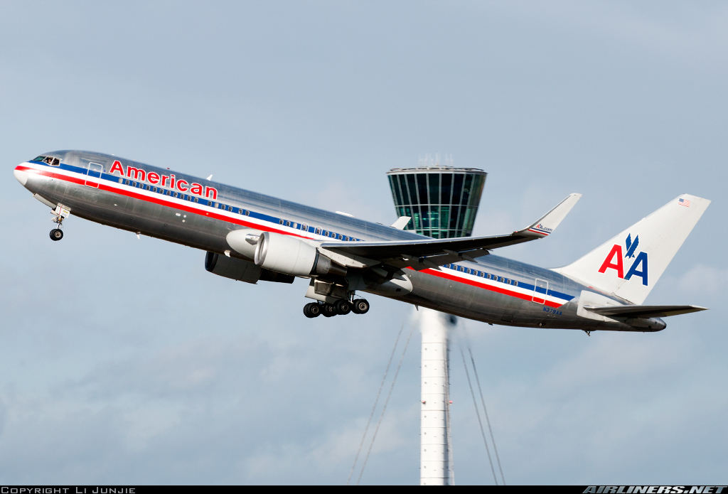
airkas1 wrote:QR: Blurry, soft. Especially the front part.
CA: Nosegear and titles are a bit sharp/jaggy, rest seems passable.
BA: slightly blurry/oversharpened.
VS: Front half seems a little soft, otherwise passable.
Dragonair: Bit low in frame, otherwise passable.
FX: Bit marginal, titles look somewhat soft, but I can easily see them getting oversharpened if sharpness is increased. Perhaps that's a sign of some haze.
EK: blurryish/haze. Most noticeably in the tail.HarryLi wrote:This time i wonder that is it possible apper Blurry after using Eraser to clean Jaggy? Because i uploaded photos recently most of them were rejected with Blurry i am very curious about it
That shouldn't happen, no. It just erases all the work you did on a photo. It doesn't touch the original. Can you write down your workflow in Photoshop?


airkas1 wrote:Could you please just post the links and not embed them? Because now I copy and paste the URL in another window, to make sure I always have the correct size photo. When you only post the link, it makes my life a lot easier when giving feedback (especially when posting multiple photos). Thanks!
ET: Soft and perhaps a little blurry (nose & tail).
AF: Passable for me.
BR: Passable for me.
CA: Nosegear looks iffy, otherwise passable for me.
airkas1 wrote:QR: Blurry, soft. Especially the front part.
CA: Nosegear and titles are a bit sharp/jaggy, rest seems passable.
BA: slightly blurry/oversharpened.
VS: Front half seems a little soft, otherwise passable.
Dragonair: Bit low in frame, otherwise passable.
FX: Bit marginal, titles look somewhat soft, but I can easily see them getting oversharpened if sharpness is increased. Perhaps that's a sign of some haze.
EK: blurryish/haze. Most noticeably in the tail.HarryLi wrote:This time i wonder that is it possible apper Blurry after using Eraser to clean Jaggy? Because i uploaded photos recently most of them were rejected with Blurry i am very curious about it
That shouldn't happen, no. It just erases all the work you did on a photo. It doesn't touch the original. Can you write down your workflow in Photoshop?
spompert wrote:Hi Harry, about the Delta: the windowline looks a bit soft somehow, while other parts look oversharpened/jaggie. Like the wheels, titles and cheatline.
The EK looks oversharpened too, especially the back part, tail.
The MD-11`s look stunning. Maybe overexposed parts, not sure. Greets
HarryLi wrote:Well. I restarted 2 MD-11 hope it can pass ....
https://imgproc.airliners.net/photos/air ... c289fa0775
https://imgproc.airliners.net/photos/air ... f1f4be26bf
Loof forward to your opinion.
HarryLi wrote:HarryLi wrote:Well. I restarted 2 MD-11 hope it can pass ....
https://imgproc.airliners.net/photos/air ... c289fa0775
https://imgproc.airliners.net/photos/air ... f1f4be26bf
Loof forward to your opinion.
Hello , I wonder that is it OVerexposed or something else problems of it ... ?
spompert wrote:HarryLi wrote:HarryLi wrote:Well. I restarted 2 MD-11 hope it can pass ....
https://imgproc.airliners.net/photos/air ... c289fa0775
https://imgproc.airliners.net/photos/air ... f1f4be26bf
Loof forward to your opinion.
Hello , I wonder that is it OVerexposed or something else problems of it ... ?
Hi, I would say the long overexposed stroke along the fuselage is not acceptable. But I am not sure about it.