I'm going to have to say Philippines. Thing looks like it was designed in Microsoft Word.

Moderators: richierich, ua900, PanAm_DC10, hOMSaR

maortega15 wrote:The PR livery is actually one of my favorites. I love the tail. But wouldn't mind them getting a new scheme. With the Philippines having so many beaches and all, they could mimic some of the other airlines in the Pacific with so much color. Air Tahiti Nui, Hawaiian, Aircalin, etc. come to mind.
There are other bad liveries out there especially with what they had previously.
China Eastern
LATAM
Avianca
Iberia
I'm undecided on Cathay Pacific and JAL. I'm not sure if I like them or not especially with what they had before.
georgiaame wrote:Nope. Worst, probably of all times and all places easily goes to Southwest. Can ANYONE find any redeeming qualities? Okay, it isn't Eurowhite, so thats one. Anything? Anyone?

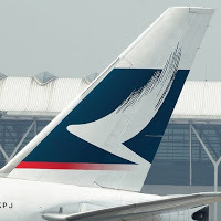
res77W wrote:CX's new livery looks unfinished, and it doesn't fit all of the planes in the fleet.
maortega15 wrote:res77W wrote:CX's new livery looks unfinished, and it doesn't fit all of the planes in the fleet.
Not just unfinished, but a lot of things don't seem to be in the right place or are just redundant. First the grey stripe. While I like it, it seems redundant since nothing is filling that space. Either you move the titles down, or move the stripe up. Next, the brushwing by the nose. Once again, you move the titles down, or you move the brushwing up on the title's level. It kinda looks in an odd place. Speaking of the brushwing, you have a solid green tail with a white brushwing while the other two brushwings are solid green. There is no cohesion. Unless it's an Airbus or a 744F, it just doesn't look right. At lest they could have done is make the brushwing by the nose white but outline it in green.
A truly missed opportunity for a once great airline.
res77W wrote:maortega15 wrote:res77W wrote:CX's new livery looks unfinished, and it doesn't fit all of the planes in the fleet.
Not just unfinished, but a lot of things don't seem to be in the right place or are just redundant. First the grey stripe. While I like it, it seems redundant since nothing is filling that space. Either you move the titles down, or move the stripe up. Next, the brushwing by the nose. Once again, you move the titles down, or you move the brushwing up on the title's level. It kinda looks in an odd place. Speaking of the brushwing, you have a solid green tail with a white brushwing while the other two brushwings are solid green. There is no cohesion. Unless it's an Airbus or a 744F, it just doesn't look right. At lest they could have done is make the brushwing by the nose white but outline it in green.
A truly missed opportunity for a once great airline.
I personally think that CX should have just updated the titles, a la China Airlines and called it good. The livery wasn't broken.
-Rowen

maortega15 wrote:I'll add Egyptair and Malaysian too. Blue doesn't really fit well with Egypt and with Malaysian, they really need consistency!
CaptnSnow71 wrote:Really? I like the new livery ok. But that old brown livery they had was disgusting
res77W wrote:maortega15 wrote:The PR livery is actually one of my favorites. I love the tail. But wouldn't mind them getting a new scheme. With the Philippines having so many beaches and all, they could mimic some of the other airlines in the Pacific with so much color. Air Tahiti Nui, Hawaiian, Aircalin, etc. come to mind.
NK's yellow livery is heinous.
-Rowen
jnev3289 wrote:The new Air Canada... Inexplicable
maortega15 wrote:The PR livery is actually one of my favorites. I love the tail. But wouldn't mind them getting a new scheme. With the Philippines having so many beaches and all, they could mimic some of the other airlines in the Pacific with so much color. Air Tahiti Nui, Hawaiian, Aircalin, etc. come to mind.
There are other bad liveries out there especially with what they had previously.
China Eastern
LATAM
Avianca
Iberia
I'm undecided on Cathay Pacific and JAL. I'm not sure if I like them or not especially with what they had before.
CaptnSnow71 wrote:I'm going to have to say Philippines. Thing looks like it was designed in Microsoft Word.
CaptnSnow71 wrote:That's the same issue I have with PR. Looks unprofessional.
maortega15 wrote:The PR livery is actually one of my favorites. I love the tail. But wouldn't mind them getting a new scheme. With the Philippines having so many beaches and all, they could mimic some of the other airlines in the Pacific with so much color. Air Tahiti Nui, Hawaiian, Aircalin, etc. come to mind.

LX138 wrote:I've always liked the Philippines scheme, a timeless classic. Yes the font could be updated but then they'd only be jumping on the bandwagon with something new.

ChrisKen wrote:This heap of ancient turd
Devilfish wrote:CaptnSnow71 wrote:I'm going to have to say Philippines. Thing looks like it was designed in Microsoft Word.CaptnSnow71 wrote:That's the same issue I have with PR. Looks unprofessional.
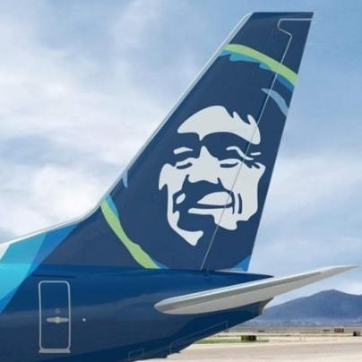
Would you rather have something like this..........
ACDC8 wrote:I've said it a million times and I'll say it a million more until they finally coming up with something fresh and creative ...
WestJet
... bland, boring, thoughtless, lifeless, outdated and just down right yawn - not one redeeming quality at all. Just a simple update, like extending the tail colours down on to the back of the fuselage and maybe larger titles. Just a little tweak can go a long way to make something look good.
SpaceshipDC10 wrote:One of the worst, too minimalist and bland as a whole and too much in your face with the titles, and it got worse with the 77W.

CaptnSnow71 wrote:georgiaame wrote:Nope. Worst, probably of all times and all places easily goes to Southwest. Can ANYONE find any redeeming qualities? Okay, it isn't Eurowhite, so thats one. Anything? Anyone?
Really? I like the new livery ok. But that old brown livery they had was disgusting
maortega15 wrote:I liked the previous rendition better.
767333ER wrote:ACDC8 wrote:I've said it a million times and I'll say it a million more until they finally coming up with something fresh and creative ...
WestJet
... bland, boring, thoughtless, lifeless, outdated and just down right yawn - not one redeeming quality at all. Just a simple update, like extending the tail colours down on to the back of the fuselage and maybe larger titles. Just a little tweak can go a long way to make something look good.
And why is this the case? Because it was designed in the 90s when everything was plain and was teal or green. It was good back then, but it has aged and probably needs to be replaced with something newer, even just a refresh.
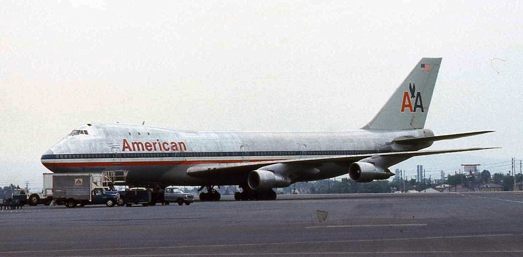
CarlosSi wrote:Looks like everyone's gotten comfy with a once controversial livery since it hasn't been mentioned once here: American's.