adambrau wrote:VC10er wrote:
I personally love “minimal” design. I like the AF livery. I love Swiss. But when AF made that change I scratched my head because it said nothing to me? Like: more modern? More hip? More Sophisticated than before? - I just got nothing from it. (Can you remind me if the typeface changed?)
The reason I brought up AF is that it was a refresh/evolution of a classic logo. I think they were able to modernize an iconic brand with classic French elegance.
OLD
https://www.youtube.com/watch?v=E4r3AoSBksEEVOLUTION
https://www.youtube.com/watch?v=JkDsYkhCl-UThe font is not so blocky and evolved into a slightly larger and more curvy sans-serif lesser bold.
Air France was run into one word - AirFrance. Simple and elegant.
Tail essentially the same except for curves at the bottom of the the barcode.
Three small changes that, to me, defined a successful livery evolution.
All backed up by very strong marketing coordination by it's agencies.
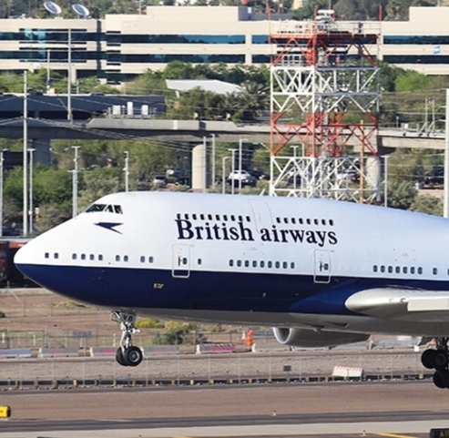
United
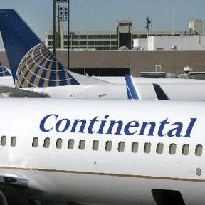
https://www.youtube.com/watch?v=2QjbeFqfajIUnited's evolution livery incorporates a swoosh, a huge billboard which is a rectangular block, and then tuned a very timid move away from the round globe logo on the tail. The elements work against each other. To me, it's horrific. Maybe United needed more than an evolution, but regardless they needed a common set of design elements that don't work against each other. After 25+ years of flying the friendly skies through the good and the bad, I wish they had left well alone or hired an agency with balls for something inspirational. I feel this United livery change makes me remember Continental and United in ugly eternity. Last 4 years as GS I have now stopped flying them. Definitely irrational but fell out of love I saw the current Frankenstein. United has lost it's iconic American feeling, and while we can debate the past liveries, I can't say this is even a livery. Perhaps an amateurish random paint job deserving for an airline which once had such great potential. YMMV.
I have been a loyal United flier for almost 30 years. I am almost not happy with anything "GLOBE' from a personal sentimental standpoint. I am not in love with this new livery, though I don't dislike it as much as you do.
Hi adambrau, For starters, it was not that the "agency did not have the balls to do something inspirational" - perhaps the agency did indeed show more inspirational design (if they did not, they should have been fired in the first presentation). It is ALWAYS the client who gets the true credit, after all it is the client that develops (writes) the design brief (hopefully based on strategic, consumer and internal insights), starting with a good or bad brief makes an enormous difference! Then briefs the agency leaders on what they want and why and also covers cost implications. After the FIRST presentation, it is the client requests any revisions to the work as they want, and ultimately it is the client who ultimately APPROVES it.
I have said this before: when I see ANY amazing branding, ideas and design, be it a livery for an, aircraft interior design, lounges etc. It's "exactly" the same dynamic for a bottle design of a bourbon, a box of cookies, cosmetics, a new identity/logo for a new or old company (old Federal Express vs New FedEx): I give FAR, more credit to the client for seeing the vision and the bravery to do something very inspirational, different, cool looking or beautiful etc, etc. Much of the BEST work I have done in my career along with the team and presented is totally at the mercy of the client. Sadly, often the boldest and most inspirational work actually sees the light of day.
Many, many factors come into play after that initial presentation. There could be 5 big "stakeholders' in the room, each of whom get a shot at saying what they like and don't like. One very big cheese might say: "I really dislike option A1' (when option A1 is actually the best) I cannot FORCE them to sign off on A1? I can fight for it up until the point where I risk getting fired, but ultimately the client IS THE CUSTOMER. THE SAME FOR BAD WORK: perhaps the agency showed fantastic work...but the client lacked the vision or taste or guts?
As for what did not meet my hopes re: UNITED, was I was hoping for an overall more upscale look given how well they have executed Polaris Lounges, and many other details, the fact that they are going full-court-press after road warriors who pay for premium travel. For me the swoosh, the typeface, the colors etc each alone on an individual basis don't really matter to me. Because as a "non-Globe" lover, I have seen MANY very well done executions of it that maximized it's fairly limited potential, it has been too established to throw away (ex: PriestmanGoode did a great job and someone at UA approved the entryway to the 77W, the Polaris Lounges, the back walls of reception in United Clubs, even the seat tag. It's the holistic take away for the consumer along the journey that matters most, tor the folks who work in the glass towers of NYC, Chicago, SF/Silicon Valley, Houston, DC, Denver and LA. "NOT US" here on a.net.
If you love AF, that is awesome. Personal opinions count very much. My SINGLE issue was when I saw it (and I look at these things through a marketing lens) was "I do not understand what AF is attempting to tell me about their brand that is new or different?" It was too close in to it's previous incarnation to subliminally register to me. Therefore probably not enough for the average French person or French Banker, and say to him ""AF just got better, classier, more up to date" - design wise it was a nice touch.
All that said: I have NO CLUE what AF senior management wanted to get out of it.