Moderators: richierich, ua900, PanAm_DC10, hOMSaR

 
User avatar
zkojq
Posts: 5434
Joined: Fri Sep 02, 2011 12:42 am

Re: New Airliners.net Homepage Preview

Fri Dec 16, 2016 7:35 am

Looks excellent!

vhtje wrote:
Better. However, please bring back 'Wings of the Web' QF 747 taking off!

That would be appreciated for sure.

AA737-823 wrote:
The only feature I care about is the "### number of photos added since your last visit."
I want that feature back.

I forgot about that. I would like it back also. Jetphotos still has it!
 
User avatar
ro1960
Posts: 1544
Joined: Wed Jan 04, 2006 8:19 am

Re: New Airliners.net Homepage Preview

Fri Dec 16, 2016 7:40 am

Like said by others, definitely more user-friendly and clear.

However I would like the advanced search form to be the default on the home page AND on the search page. The basic search is just useless. If you could go back to the old advanced search form, even better ! The new one is just a pain and returns most of the time nothing.

Thanks guys for listening to all the feedback and keep up the good work!
 
User avatar
winterlight
Posts: 1432
Joined: Wed Oct 29, 2014 8:57 am

Re: New Airliners.net Homepage Preview

Fri Dec 16, 2016 7:53 am

Link takes me to this page.
 
User avatar
wnskyguy
Posts: 1
Joined: Thu Sep 12, 2013 5:31 pm

Re: New Airliners.net Homepage Preview

Fri Dec 16, 2016 8:49 am

I like the look of the revamped page, much better than this current one. Thanks for listening to us.
 
azz767
Posts: 169
Joined: Fri Jul 22, 2016 9:08 am

Re: New Airliners.net Homepage Preview

Fri Dec 16, 2016 8:49 am

Can we have the feature back on the forums where when you hover over the abbreviated airports/airline codes the full name shows up in a window?
 
User avatar
NIKV69
Posts: 15606
Joined: Wed Jan 28, 2004 4:27 am

Re: New Airliners.net Homepage Preview

Fri Dec 16, 2016 8:57 am

MUCH BETTER! As one of replies stated bring back Sam's 747 as well.
 
pascal7z
Posts: 18
Joined: Sat Oct 10, 2009 10:06 am

Re: New Airliners.net Homepage Preview

Fri Dec 16, 2016 9:01 am

Looks good and reminds me of the old homepage. I would vote yes for it.
 
dutchspotter1
Posts: 532
Joined: Tue Jul 26, 2005 9:24 pm

Re: New Airliners.net Homepage Preview

Fri Dec 16, 2016 9:12 am

.
 
310815
Posts: 1039
Joined: Wed Nov 09, 2011 4:03 pm

Re: New Airliners.net Homepage Preview

Fri Dec 16, 2016 9:33 am

I am sorry to say, but the current frontpage is better. The large Top5 thumbnails were a huge improvement, as well as the new display of photographer's choice.
And I certainly didn't miss the featured photo Album or top rated photos section. Especially the latte is rather senseless to me.

Actually there were a few good things with the site upgrade, a shame to go back so dramatically. Again don't get me wrong I always liked the old Website, but the design was outdated and made for small Monitor resolutions.
 
User avatar
nimool
Posts: 192
Joined: Fri Oct 12, 2012 6:44 pm

Re: New Airliners.net Homepage Preview

Fri Dec 16, 2016 9:33 am

Yess!!
The new homepage preview looks good, same as the old version.
In my opinion I think the forums need to be redone too, having to go to ex page for newer posts is very irritating, hope it can be done, if not we will still love A.net :white:
 
User avatar
plusultra
Posts: 2
Joined: Tue Jun 02, 2009 7:52 am

Re: New Airliners.net Homepage Preview

Fri Dec 16, 2016 9:40 am

Buenos días. Me gustan las mejoras introducidas en la nueva página, me recuerdan a la antigua que para mi opinión era la mejor.
Echo de menos el logo del 747 y poder ver que estas logado con tu foto de perfil. Felicidades.
 
User avatar
plusultra
Posts: 2
Joined: Tue Jun 02, 2009 7:52 am

Re: New Airliners.net Homepage Preview

Fri Dec 16, 2016 9:41 am

Buenos días. Me gustan las mejoras introducidas en la nueva página, me recuerdan a la antigua que para mi opinión era la mejor.
Echo de menos el logo del 747 y poder ver que estas logado con tu foto de perfil. Felicidades.
 
User avatar
VirginFlyer
Posts: 5933
Joined: Sun Sep 10, 2000 12:27 pm

Re: New Airliners.net Homepage Preview

Fri Dec 16, 2016 9:41 am

First off, I'd like to say I appreciate the level of input that is being sought about these features. I started using Airliners.net in 2000, and was quite active on it till the mid to late 2000s (I can't remember when I dropped off). I've recently been using it more since the site upgrade (I was interested to see what the upgrade was like, and was pleasantly surprised by the lack of bugs that had been plaguing A.net in the first half of the 2010s. I just missed the period of all white, which would have driven me bonkers). So I'm going to make these comments with that background in mind.

Colour
The colour palette on the current homepage and forums (medium and dark blue) is easy to use, and screams Airliner.net to me, as the colour palette we were all very familiar with from the 2000s.
The colour palette on the proposed new homepage featuring a lot of light and pale blue (which was on the previous late 2000s/early 2010s homepage, if I remember the dates properly) is less friendly on my eyes, and doesn't look as "A.netty" to me.
I would therefore propose the colour palette we see on the current version of the homepage is retained.

General Layout
The original A.net home page had a very simple layout, with a photo search engine in the middle, top viewed photos below, and sidebars on either side which contained options. It was good at the time, but probably limiting, and not necessarily immediately engaging. The front and centre presence of the search engine was definitely good though.
The current A.net home page takes up a bit more space, but I enjoy the orderly nature of the overall layout, including the vertical and horizontal alignment of boxes containing content.
The proposed new layout retains the vertical alignment, but loses the horizontal alignment of the content boxes. This may be more space efficient, but looks less orderly than the current homepage. I dislike it.
I would propose retaining the current home page's orderly layout.

Text headings
I *think* I prefer the normal text of the headings in the current homepage to the ALL CAPS TEXT of the headings in the proposed new homepage.

Content
The original A.net homepage didn't have a lot of content, and it has taken a while to get used to the content now available. That said, I think the content we have available is broadly good. Here are my thoughts on the specific pieces of content on the homepage:
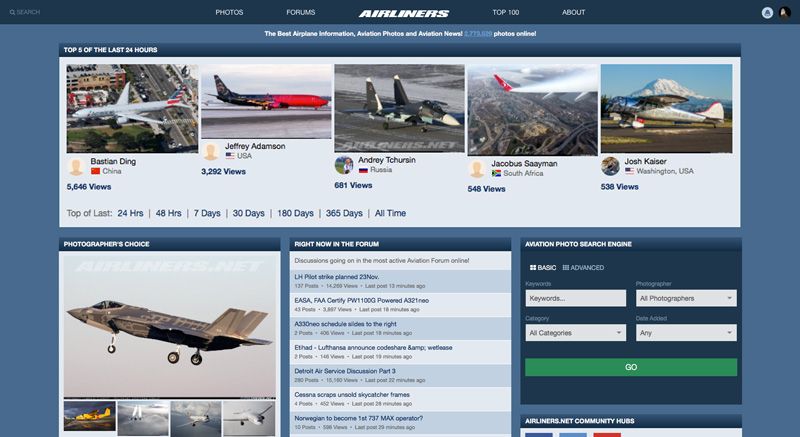
  • Top 5 of the Last 24 Hours - I am glad this has been kept at the top. I do prefer the full width layout of it in the existing homepage to the 2/3 width layout in the proposed new homepage. The slight gap between photographs which is proposed for the new homepage is an improvement over the existing one. One further aesthetic improvement could be (and I saw this without knowing how it will look) to vertically centre each of the five photographs displayed, and have the photographer name all at the same vertical position instead of being a set distance below the bottom of the photograph, as is the case in both the current and proposed homepages. A functional aspect which the original airliners.net had was when you selected, say, 7 days, it displayed the top photos of the last 7 days in the same place, rather than taking you to a search page. If this could be implemented again, that would be good.
  • Photo Search Engine - It is good to see this making a return on the proposed new homepage, it is definitely missing from the current homepage. I'm not a great fan of the current search options in the basic search, but the things I would want there (Airline, Location, Basic Type) talk to other stuff in the more advanced search, and I think it would be worse to split those up. I think there is more thought that needs to go into the presentation of the search engine, but that is outside the scope of what is being asked here. Given I am going to be using the advanced search mostly, I dislike that the proposed layout requires me to scroll to enter details, and puts the GO button off the edge of the box. I would like to suggest therefore that the photo search engine be given a full width content box, and in the basic view shows the fields Keyword, Photographer, Category, Date Added, with the GO button underneath this (centred and taking up 1/3 width). Selecting the advanced option should then cause layout to be as follows:
    Keyword - Photographer - Category - Date Added
    Country - Region - Location - Date
    Basic Type - Generic Type - Version - Manufacturer - Builder
    Airline - Identification Numbers

    GO button would still be centred, and still be 1/3 width
  • Photographer's Choice - I prefer how the proposed page presents this as only 1/3 width rather than 2/3 width, and how the thumbnails below the photo have a small gap between them. However I prefer how the current page allows you to scroll through the 5 photos, rather than just seeing the top one plus four smaller thumbnails.
  • Right now in the Forums - I enjoy the presence of this feature, although I don't understand how it works - it usually displays for me with a bit of a lag, showing topics as having been posted in upwards of 30 minutes ago. A more direct display of the current top topics would be preferable if possible. Being able to order by most views, most replies, most recent activity would be cool, but could be a bit too much detail for the homepage. I do like the suggestion someone made of highlighting more than one forum.
  • Featured Photographers - I prefer the presentation of this section on the existing homepage compared to the proposed one.
  • Airliners Headlines (Banner News) - This is one of my favourite features of the current homepage. I like it as it is on the current homepage, where a single photo appears with a text description underneath, and scrolls through on a timer, or by dragging. I'm less of a fan of the list view shown on the proposed homepage.
  • Top Photographers - I prefer the option showing 10 photographers in the proposed homepage, to the option showing five in the current homepage. If there was an option to have the same time-period options as in the top photographs, that would be great.
  • Top Rated Photos - This is a good feature on the proposed homepage which is missing on the current homepage. I would like to see it displayed in the same manner I have described Photographer's Choice
  • Latest News - To be honest I hardly ever use this feature. There doesn't seem to be any significant difference between versions, except I not the proposed homepage erroneously says "Discussions going on in the most active Aviation Forum online!"
  • Airliners.net Community Hubs - I'm not sure how necessary the Facebook/Twitter/YouTube icons are, given they are also at the bottom of the home page. The Facebook feed on the other hand isn't a bad idea. If a Twitter feed could be added too, there would be no need for the three icons.
  • Searches on Airliners.net - This sections seems redundant to me - the top photos already have their own section, and the categories are listed in the search engine.

Some suggestions

I would like to suggest that by and large the homepage as kept as it is, with some of the improvements in the proposed homepage which I've highlighted above incorporated into it. In particular, I would like to recommend that the current colour palette is not replaced with the one being proposed.

I would like to suggest a layout which displays as follows, in the following rows for a full width screen:
  1. Top 5 viewed [full width, of the last 24 hours by default, with option to select other time periods]
  2. Photo Search Engine [full width, basic by default, option to select advanced which would shift all other content down]
  3. Right now in the forums [1/3 width, left, Civil Aviation by default, can be set to others] | Right now in the forums [1/3 width, centre, Tech/Ops by default, can be set to others] | Right now in the forums [1/3 width, right, Aviation Photography by default, can be set to others]
  4. Airliners News [1/3 width, left] | Featured Photographer [1/3 width, centre] | Top Photographers [1/3 width, right]
  5. Photographers Choice [1/3 width, left] | Featured Album [1/3 width, centre] | Top Rated Photos [1/3 width, right]
  6. Latest News [1/3 width, left] | Facebook Feed [1/3 width, centre] | Twitter Feed [1/3 width, right]

If the page is narrower, then it would change to a 2 abreast layout:
  1. Top 5 viewed [full width, of the last 24 hours by default, with option to select other time periods]
  2. Photo Search Engine [full width, basic by default, option to select advanced which would shift all other content down]
  3. Right now in the forums [1/2 width, left, Civil Aviation by default, can be set to others] | Right now in the forums [1/2 width, right, Tech/Ops by default, can be set to others]
  4. Right now in the forums [1/2 width, left, Tech/Ops by default, can be set to others] | Airliners News [1/2 width, right]
  5. Featured Photographer [1/2 width, left] | Top Photographers [1/2 width, right]
  6. Photographers Choice [1/2 width, left] | Featured Album [1/2 width, right]
  7. Top Rated Photos [1/2 width, left] | Latest News [1/2 width, right]
  8. Facebook Feed [1/2 width, left] | Twitter Feed [1/2 width, right]

And if it was narrower still (for instance on a mobile device) it would be the same content sections one at a time.

V/F
 
User avatar
angelopga
Posts: 74
Joined: Fri May 12, 2006 5:11 am

Re: New Airliners.net Homepage Preview

Fri Dec 16, 2016 9:49 am

Perfect. I really prefer this one.
 
User avatar
VirginFlyer
Posts: 5933
Joined: Sun Sep 10, 2000 12:27 pm

Re: New Airliners.net Homepage Preview

Fri Dec 16, 2016 10:09 am

Another thought - given many people seem to like the light/pale blue colour palette of the proposed new homepage, and others like myself prefer the darker colour palette of the current homepage, perhaps this could be an option in the preference in our profile settings like the options for links opening in a new tab or not, and for photos to display as one or two coloumns.

That may be a way to keep just about everyone happy.

V/F
 
User avatar
FlySail2015
Posts: 68
Joined: Thu Jul 14, 2016 3:59 am

Re: New Airliners.net Homepage Preview

Fri Dec 16, 2016 10:22 am

Oh thank God! Now just gotta fix the advanced search formatting (a search for Southwest Boeing 737s I did earlier somehow provided no results), and we'll be good to go! Looks great guys!
 
User avatar
JohnKrist
Head Support
Posts: 1982
Joined: Sat Jan 22, 2005 11:54 pm

Re: New Airliners.net Homepage Preview

Fri Dec 16, 2016 10:23 am

winterlight wrote:
Link takes me to this page.

Yes, but the homepage link is in the first post
 
sofianec
Posts: 184
Joined: Thu Aug 30, 2007 6:39 am

Re: New Airliners.net Homepage Preview

Fri Dec 16, 2016 11:38 am

The new homepage is a vast improvement imho. Great work!
 
User avatar
Aviaphile
Posts: 76
Joined: Wed Sep 28, 2016 9:27 am

Re: New Airliners.net Homepage Preview

Fri Dec 16, 2016 12:21 pm

Like it. Thanks for taking members' views into account. Also would like to see the feature which allowed one to go to the first unread reply in a thread re-instated. Now one has to scroll through tracts of replies to find where the last post was.
 
User avatar
MD80
Posts: 769
Joined: Sun Feb 16, 2014 3:29 pm

Re: New Airliners.net Homepage Preview

Fri Dec 16, 2016 12:54 pm

seat1a wrote:
My only complaint is the search boxes. The former pull down menus were so much more functional. My two cents.


100% agreed. The former pull down menu was much more functional.

I am pleased to see the improvements. Thanks for the work.
 
123
Posts: 629
Joined: Sat Nov 29, 2003 3:49 am

Re: New Airliners.net Homepage Preview

Fri Dec 16, 2016 1:58 pm

Great, new "old" style website is great to see back the userfriendly way I started to like a.net in the past, and will visit for sure with higher frequency.
 
A388
Posts: 8256
Joined: Mon May 21, 2001 3:48 am

Re: New Airliners.net Homepage Preview

Fri Dec 16, 2016 2:23 pm

Yes, that's why I like the older version because it's easier to navigate. And yes, the search function of the new website irritates me as you first see all the search options on top before you see the actual search results. I also don't like the photos and links that open on the same page and not in a new window as the old website. The dropdown menu was much easier and I find the opening of photos and internet links in a new window much easier too. This is my personal opinion but really I hope airliners.net will keep this (or bring it back).


A388
 
User avatar
HarryLi
Screener
Posts: 1061
Joined: Sun Jan 11, 2015 9:51 am

Re: New Airliners.net Homepage Preview

Fri Dec 16, 2016 2:37 pm

Oh ! So surprise to see this page again. But .... i prefer the B747 on the Homepage.
 
User avatar
airkas1
Posts: 7904
Joined: Sat Dec 20, 2003 7:01 am

Re: New Airliners.net Homepage Preview

Fri Dec 16, 2016 2:51 pm

A388 wrote:
I also don't like the photos and links that open on the same page and not in a new window as the old website. The dropdown menu was much easier and I find the opening of photos and internet links in a new window much easier too. This is my personal opinion but really I hope airliners.net will keep this (or bring it back).

This was fixed 2 days ago. Details are in the Issues FAQ thread.
 
motif1
Posts: 281
Joined: Fri Sep 23, 2005 3:31 am

Re: New Airliners.net Homepage Preview

Fri Dec 16, 2016 3:01 pm

I like the new suggestion. Good job!
 
User avatar
ojjunior
Posts: 1123
Joined: Thu Jul 13, 2006 12:31 am

Re: New Airliners.net Homepage Preview

Fri Dec 16, 2016 3:28 pm

Almost there.
But still a ridiculous search engine layout.
Dropdown menus in thinner lines are enough.
No one likes moving, yelling, busy prontpages. This isn't a kid website.
 
User avatar
JohnKrist
Head Support
Posts: 1982
Joined: Sat Jan 22, 2005 11:54 pm

Re: New Airliners.net Homepage Preview

Fri Dec 16, 2016 3:48 pm

Aviaphile wrote:
Like it. Thanks for taking members' views into account. Also would like to see the feature which allowed one to go to the first unread reply in a thread re-instated. Now one has to scroll through tracts of replies to find where the last post was.


It's there, just click the icon left of the unread topic.
 
khpn
Posts: 116
Joined: Mon Sep 27, 2010 3:30 pm

Re: New Airliners.net Homepage Preview

Fri Dec 16, 2016 3:55 pm

After looking at them side by side, I actually think i like the "new" version better.

However, either way, you should standardize the size of the home page photos, looks kind of strange to see them all of varying sizes.
 
User avatar
SuperSix2
Posts: 112
Joined: Tue Jun 17, 2014 11:24 am

Re: New Airliners.net Homepage Preview

Fri Dec 16, 2016 4:32 pm

Yep it looks great....Make it so!
 
User avatar
Kaphias
Posts: 722
Joined: Sat Nov 13, 2010 6:29 am

Re: New Airliners.net Homepage Preview

Fri Dec 16, 2016 4:51 pm

Based on the feedback here, I'd try something like this:

Image
 
User avatar
HarryLi
Screener
Posts: 1061
Joined: Sun Jan 11, 2015 9:51 am

Re: New Airliners.net Homepage Preview

Fri Dec 16, 2016 5:53 pm

Softaero wrote:
Better, but the current (non-redux) home page is more suitable for mobile users.


YES ! I agree. It is more comfortable than before.
 
User avatar
Classa64
Posts: 374
Joined: Fri Apr 03, 2015 5:40 pm

Re: New Airliners.net Homepage Preview

Fri Dec 16, 2016 6:01 pm

like the redu better than current. thanks for the hard work.
c.
 
User avatar
QB737
Posts: 337
Joined: Mon Mar 10, 2003 2:28 am

Re: New Airliners.net Homepage Preview

Fri Dec 16, 2016 6:18 pm

I like it better. Good job.
 
cubastar
Posts: 314
Joined: Wed Nov 15, 2006 11:48 pm

Re: New Airliners.net Homepage Preview

Fri Dec 16, 2016 6:40 pm

I do believe this is a good improvement over the recent changeover. I am not against change or updating but I do think that the changeover from the original format was too abrupt and not quite as well thought out as it should have been. There are an abundant amount of "old timers" on here who did not really see the need for a large makeover. Thanks, Cubastar (John)
 
F9Animal
Posts: 5309
Joined: Thu Dec 16, 2004 7:13 am

Re: New Airliners.net Homepage Preview

Fri Dec 16, 2016 7:11 pm

Yep!!! I like the old homepage!!! Some of us are not good with change, and this will be nice on the eyes!
 
F9Animal
Posts: 5309
Joined: Thu Dec 16, 2004 7:13 am

Re: New Airliners.net Homepage Preview

Fri Dec 16, 2016 7:11 pm

Kaphias wrote:
Based on the feedback here, I'd try something like this:

Image


Yes!!! I Iike this alot!
 
310815
Posts: 1039
Joined: Wed Nov 09, 2011 4:03 pm

Re: New Airliners.net Homepage Preview

Fri Dec 16, 2016 8:59 pm

Kaphias wrote:
Based on the feedback here, I'd try something like this:

Image


Totally agree with this, please don't make the thumbnails of the top5 smaller.
 
SPREE34
Posts: 1780
Joined: Tue Jun 29, 2004 6:09 am

Re: New Airliners.net Homepage Preview

Fri Dec 16, 2016 10:06 pm

Would still like to see the text and text background in different colors. That blue is not easy on the eyes.
 
tjerome
Posts: 515
Joined: Fri Sep 09, 2016 3:03 am

Re: New Airliners.net Homepage Preview

Sat Dec 17, 2016 1:34 am

I actually like the current homepage better than the older version. There is just so much clutter and disorganization in the older version and I for one don't want to see that come back. The current homepage is clean and well organized.

The only thing that I would like to see improved on this site is having the same top bar on the forums. From the homepage and photos areas you have the top bar with Photos, Forums, Airliners.net, Top 100, and About. Please bring that to the Forums pages too. I hate what is here (sidebar, forum, FAQ and on the far right is notifications/messages, followed by the second row with airliners.net and search on the far right). What would be best is bringing the other top bar with photos, forum, airliners.net, etc. and then have a second row with search area, notifications and messages.
 
CWizard
Posts: 51
Joined: Wed Jun 15, 2016 4:50 pm

Re: New Airliners.net Homepage Preview

Sat Dec 17, 2016 1:48 am

flybynight wrote:
Old style was so much better. Don't forget about the747 logo. That should be part of it.


Agreed.
I've been lurking for many, many years, and sincerely appreciated the opportunity to "contribute" (post to the board), but there is absolutely NOTHING about the "new" software that makes it superior to the "old.' Nothing. Perhaps, again, perhaps, from a system administrator point of view, the "new" software is an "improvement," but since you were charging for access to a message board (come on, really?) you didn't do your paying customers any favors.
 
User avatar
LatAmFlyer
Posts: 143
Joined: Thu Jul 10, 2014 1:48 pm

Re: New Airliners.net Homepage Preview

Sat Dec 17, 2016 2:51 am

atcsundevil wrote:
slvrblt wrote:
it would be nice to have some of the old capabilities back, like the hover over airport city codes that would tell you what the location was.

I don't think that's doable. That was a very unique feature of the old site platform that functioned poorly in the later days.


Why not?
 
User avatar
atcsundevil
Moderator
Posts: 6130
Joined: Sat Mar 20, 2010 12:22 pm

Re: New Airliners.net Homepage Preview

Sat Dec 17, 2016 3:21 am

LatAmFlyer wrote:
atcsundevil wrote:
slvrblt wrote:
it would be nice to have some of the old capabilities back, like the hover over airport city codes that would tell you what the location was.

I don't think that's doable. That was a very unique feature of the old site platform that functioned poorly in the later days.


Why not?

It might be -- I'm no expert -- but there were a lot of really unique things about the old site (many of which didn't function well over the past few years) that would be incredibly time consuming to try to replicate on the new site. I know they're going to look at it after higher priority items are taken care of, but in the end, it is just a handy tool that can easily be replaced with a Google search. It isn't something that really makes or breaks this as a site, in my opinion. Other similar sites that I'm aware of don't use the hover function, so it's really just a comparison to ourselves. We might just need to get used to a new norm. Change isn't always bad, it's just different!
 
seat1a
Posts: 1140
Joined: Mon Jan 11, 2010 7:52 pm

Re: New Airliners.net Homepage Preview

Sat Dec 17, 2016 3:33 am

Where's the snow?!?!? ;-)
 
User avatar
WarRI1
Posts: 14195
Joined: Thu Sep 20, 2007 10:51 am

Re: New Airliners.net Homepage Preview

Sat Dec 17, 2016 4:33 am

I like the looks of the new page, it seems familiar which I like. I also hope the forums will include the information we used to have about replies, the number and who is replying without going back to the group heading as we do now.
 
Galaxy1530
Posts: 15
Joined: Thu Nov 10, 2016 5:19 am

Re: New Airliners.net Homepage Preview

Sat Dec 17, 2016 5:30 am

Yay new home page!
 
User avatar
OA940
Posts: 1991
Joined: Fri May 20, 2016 6:18 am

Re: New Airliners.net Homepage Preview

Sat Dec 17, 2016 8:25 am

The new site is better, as it is more modern, but its layout kinda sucks. The old homepage layout is by far superior, and with the new site's refresh it will be much better.
 
User avatar
Putnik
Posts: 125
Joined: Sat Aug 04, 2007 2:35 am

Re: New Airliners.net Homepage Preview

Sat Dec 17, 2016 8:35 am

Thank you for changing things once again. I actually stopped visiting the site frequently when the last makeover happened as it remained very difficult to navigate and the photo search kept providing unwanted results. The new change is a pleasant surprise. Keep up the good work.
 
User avatar
CARST
Posts: 1630
Joined: Tue Jul 25, 2006 11:00 pm

Re: New Airliners.net Homepage Preview

Sat Dec 17, 2016 9:11 am

Looks okayish, despite I got used to the new look already and now think it doesn't need a change.

But if you change it ... where is the old 747 top-banner?
 
Oykie
Posts: 2301
Joined: Sat Jan 07, 2006 9:21 am

Re: New Airliners.net Homepage Preview

Sat Dec 17, 2016 12:43 pm

I was one of the few people who liked the change initially. Of course if was not perfect, but the tweaks that have been done, makes med feel at home. The new frontpage looks nice. It looks like the old, but with a fresh new look. I was not able to load the page from my mobile phone. I like how the current site works on cellphone, compared to the old layout, that only showed pictures.
 
lbreflections
Posts: 4
Joined: Sun Oct 30, 2016 2:02 pm

Re: New Airliners.net Homepage Preview

Sat Dec 17, 2016 4:48 pm

Thumbs up!

Who is online

Users browsing this forum: No registered users and 24 guests

Popular Searches On Airliners.net

Top Photos of Last:   24 Hours  •  48 Hours  •  7 Days  •  30 Days  •  180 Days  •  365 Days  •  All Time

Military Aircraft Every type from fighters to helicopters from air forces around the globe

Classic Airliners Props and jets from the good old days

Flight Decks Views from inside the cockpit

Aircraft Cabins Passenger cabin shots showing seat arrangements as well as cargo aircraft interior

Cargo Aircraft Pictures of great freighter aircraft

Government Aircraft Aircraft flying government officials

Helicopters Our large helicopter section. Both military and civil versions

Blimps / Airships Everything from the Goodyear blimp to the Zeppelin

Night Photos Beautiful shots taken while the sun is below the horizon

Accidents Accident, incident and crash related photos

Air to Air Photos taken by airborne photographers of airborne aircraft

Special Paint Schemes Aircraft painted in beautiful and original liveries

Airport Overviews Airport overviews from the air or ground

Tails and Winglets Tail and Winglet closeups with beautiful airline logos